Luma
CHALLENGE
The current grocery shopping experience is designed to be as frictionless as possible. The food industry capitalizes on our busy lifestyles by promoting effortless shopping through various means like advertisements, product placements, and sometimes misleading labeling. However, what if there was something that could make us more mindful of what we’re buying and help us align our grocery lists with values we care about?
OUTCOME
Luma was designed to illuminate these hidden influences in the grocery shopping process. Luma is an unassuming grocery cart that reacts to the products you add, based on the parameters you care about—whether it's the environmental impact of a product, its brand’s ethics, or how far it has traveled. The cart "lights up" to reflect these choices, creating a visual representation of the values behind the products in your cart. Luma invites users to step out of autopilot mode and engage more consciously with the food system, making decisions aligned with their personal values.
Role: XR and Physical Prototype, Design Research
-
Spring ‘22
3 months -
DESIGN RESEARCH
We began by analyzing the behaviors and influences at play in a typical grocery shopping experience. We discovered that many customers shop on autopilot, guided by subtle but powerful industry techniques—73% of cereal sales, for instance, are dominated by just three brands. Product placement strategies like “Power Walls” and checkout layouts reinforce quick decisions. Our user research confirmed that shoppers often feel overwhelmed by information overload and misleading labels, leaving little room for reflection.
These snapshots capture key moments from our behavioral research, highlighting how users interact with grocery store environments. Observations include how shoppers navigate aisles, engage with product placements, and make quick decisions driven by visual cues and promotions. These insights informed the development of Luma, with a focus on disrupting autopilot behaviors by bringing hidden information to the surface and encouraging thoughtful, value-based decision-making throughout the shopping journey.
INSIGHTS
From this research, we gained a clear understanding of the grocery shopping environment’s role in perpetuating brand monopolies and consumer confusion. Shoppers needed more opportunities to pause, reflect, and regain control over their choices. We realized that the design had to bring hidden information—about both products and brands—into the light, literally and figuratively.
The goal was to design a system that would break through the industry's tactics and encourage thoughtful consumption. We synthesized the research into a core design idea: a grocery cart that reacts to products based on the user's chosen parameters. This concept provided a tactile and visual way to help users become aware of their decisions, offering reflection moments throughout their shopping journey.
DESIGN SOLUTION
Personal Parameters
At the beginning of their shopping trip, users select a parameter to explore—such as the carbon footprint, fair trade status, or distance traveled by their food. Luma tailors its response to this parameter, creating a personalized shopping experience.
Visual Cues
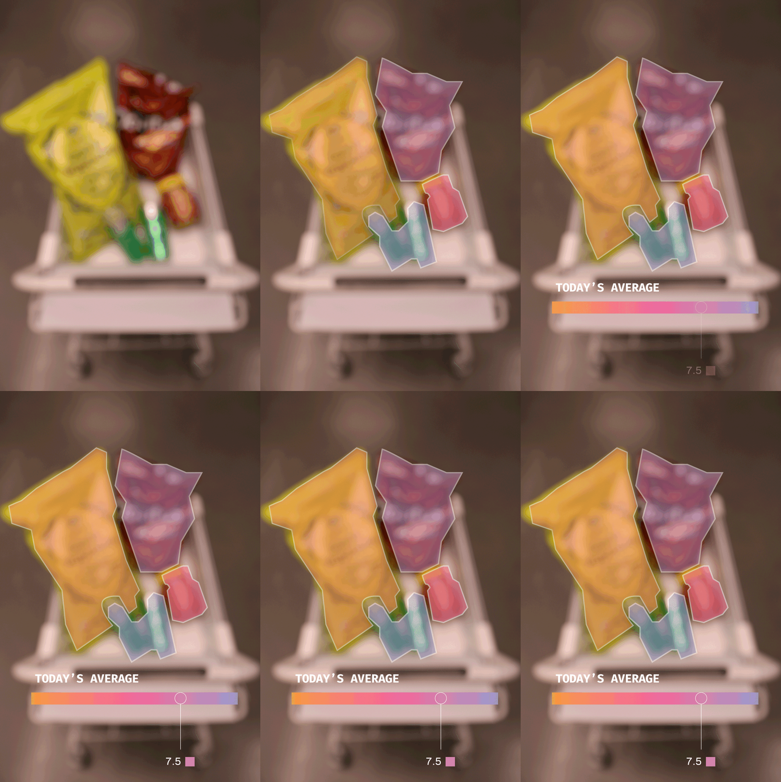
As items are added to the cart, Luma lights up, providing immediate feedback on how those products align with the user’s values.
Reflect
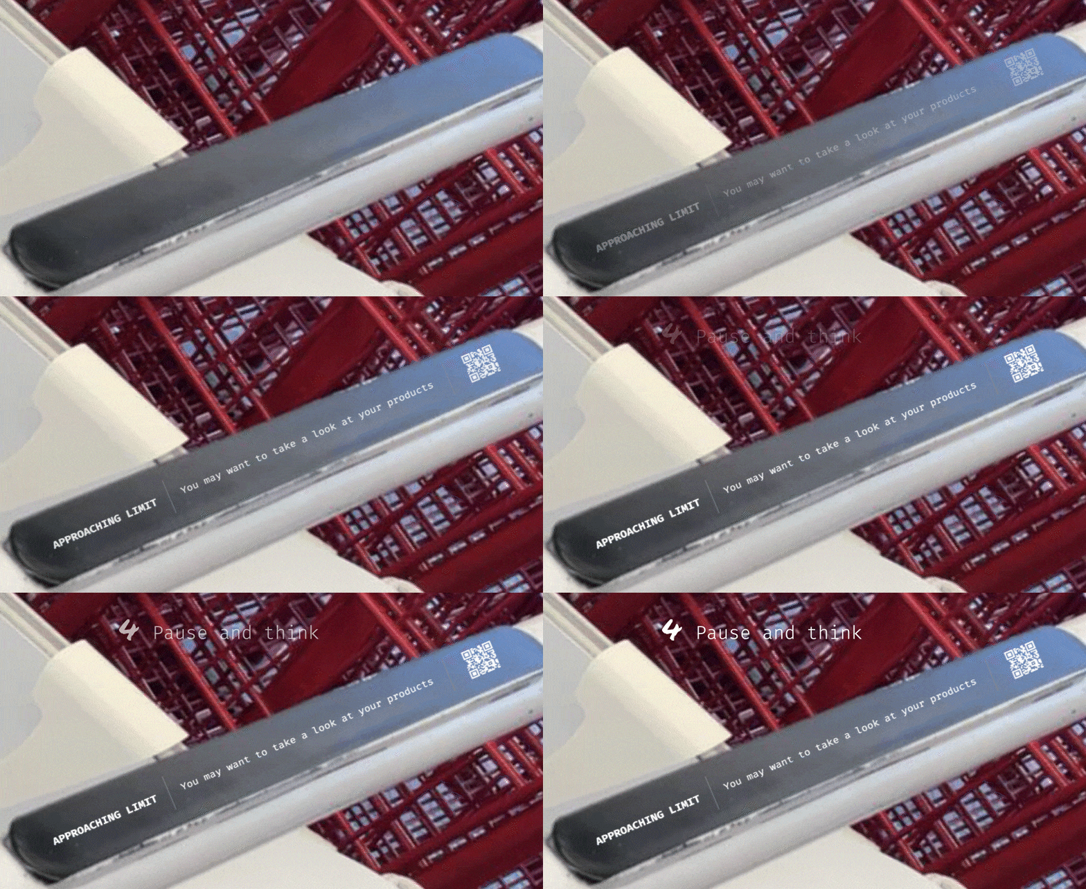
When your set threshold is approached, Luma gently beams, inviting you to reflect on your choices. Your carbon footprint limit is nearly reached—perhaps it’s time to take a second look at your items and consider more sustainable alternatives?
Scan
By scanning a code on the cart, users can explore products in augmented reality (AR)
Review
Luma’s AR feature highlights hidden information not just about the product but also about the parent company, giving shoppers a fuller understanding of what they’re buying. Users can even scan shelf spaces to discover alternative products that may align better with their values but are placed in less prominent locations.
Share
Luma provides an overview of the entire cart, summarizing the shopper’s journey based on their chosen parameters. This overview can be shared on social media, creating a commitment device that encourages sustainable habits. Luma also offers a path to engage with broader policies in the food industry, helping users connect their personal choices with systemic change.
IMPLEMANTATION
Food Mile Pop-Ups and Strategic Partnerships
To bring Luma’s mission of mindful shopping to life, we plan to implement Food Mile Pop-Ups in grocery stores, where users can immediately see the distance their food has traveled from farm to shelf. These pop-ups will appear in-store or within the Luma app, highlighting products with shorter travel distances to encourage more sustainable choices. The visual cue of "food miles" will allow shoppers to quickly grasp the environmental impact of their selections, reinforcing Luma's core principle of making hidden information visible.
In addition, strategic partnerships with key organizations will amplify Luma’s impact by aligning with nonprofits and NGOs focused on food sustainability, ethical sourcing, and consumer education. Some potential partners include:
The Food and Agriculture Organization (FAO): To promote sustainable farming practices and reduce food miles.
Fairtrade International: To support ethical sourcing and fair trade products.
The Environmental Working Group (EWG): To highlight products that meet strict environmental standards and reduce harmful practices in agriculture.
Slow Food International: To encourage choices that prioritize local, traditional, and eco-friendly food systems.
These partnerships will not only extend Luma’s reach but also help create a network of consumer education, making it easier for shoppers to act on their values and contribute to a more transparent and sustainable food system. Together, these initiatives will turn Luma’s vision into a scalable solution that both informs and empowers consumers to make thoughtful choices.
Companion Ticket: Make a Plan Behavior Aid
In the final section of Luma's experience, users receive a Companion Ticket, which acts as a behavior aid designed to encourage reflection and future planning. This ticket summarizes the user’s shopping journey and provides actionable steps to improve sustainability choices. The "Make a Plan" section helps shoppers commit to positive changes by offering suggestions like trying a new sustainable item, replacing a current product with a more ethical option, or aiming to reduce their overall carbon footprint or water usage.
By breaking down changes into manageable steps, the Companion Ticket transforms insights gained during shopping into concrete, achievable goals for the next trip. This reinforcement of sustainable habits creates a sense of ongoing accountability and progress, bridging the gap between knowledge and action.
PROTOTYPING PROCESS
USER JOURNEY
We developed a user journey map that tells the story of a typical grocery shopping experience, starting from the moment you realize you need groceries to the final step of unpacking items at home. Each step, from entering the store to choosing items and checking out, is marked by subtle touchpoints—like your pantry at home, the shopping cart, or the checkout system—that guide your decisions. Along the way, emotions fluctuate as you move through the aisles, influenced by product placements and sales. Actions, such as making a list or scanning items at checkout, reflect the natural flow of the shopping process.
This initial version of the user journey map outlines the key phases of a typical grocery shopping experience, but focuses on potential touchpoints for intervention.
Design process within multidisciplinary teams can be challenging. The following photo captures the result of an alignment exercise our team conducted when we realized our visions for the project weren’t fully matching up. During a workshop, we redefined the core values and product goals to ensure everyone was on the same page. The process involved filling in gaps in our understanding and solidifying the project’s direction, leading to the final definition seen here. This experience taught me the importance of creating and realigning visions within a multidisciplinary team, bridging the gap between engineering and design to ensure cohesion and collaboration throughout the project.
In the final Service Blueprint Luma is seamlessly woven into this journey, lighting up and offering feedback when items are added to your cart based on the parameters you care about, such as sustainability or ethical sourcing. As you shop, Luma provides real-time feedback, encouraging you to reflect on your choices and explore alternative products that might align more closely with your values. By integrating moments of pause and reflection, Luma transforms an otherwise automatic experience into a thoughtful, intentional one.
The final service blueprint showcases the comprehensive grocery shopping experience with Luma fully integrated. It maps out key steps, touchpoints, and user actions, while incorporating Luma’s unique role in providing real-time feedback, product insights, and personalized reflection moments. The blueprint also visualizes how the backend processes, like data aggregation and augmented reality features, support the user experience. This detailed overview highlights Luma’s ability to turn a routine shopping trip into an informed, reflective, and value-driven journey, making hidden product information accessible and actionable for consumers.
PHYSICAL PROTOTYPE
In designing the physical prototype for Luma, our main priority was to avoid triggering feelings of guilt, which often accompany certain visual cues associated with "right" and "wrong." Colors like red and green already carry strong cultural associations—green signaling approval and red indicating a mistake. We wanted to steer away from this binary thinking and instead create a more neutral, peaceful experience for the user.
In designing the physical prototype for Luma, our main priority was to avoid triggering feelings of guilt, which often accompany certain visual cues associated with "right" and "wrong." Colors like red and green already carry strong cultural associations—green signaling approval and red indicating a mistake. We wanted to steer away from this binary thinking and instead create a more neutral, peaceful experience for the user.
To achieve this, we experimented with different textures, softer color palettes, and overall aesthetics that conveyed calmness and reflection rather than judgment. Our final prototype aimed to encourage thoughtful decision-making without imposing pressure or guilt on the shopper.
From sketch to production
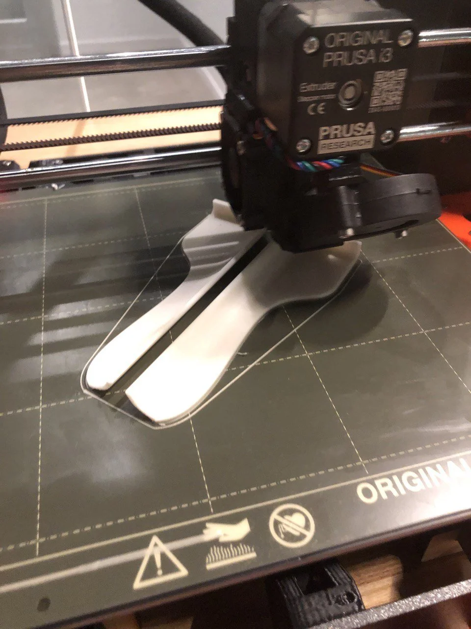
The working prototype incorporated an Arduino board coded to an RFID system. This technology allowed the cart to light up in different sequences based on the items added to it, creating a dynamic visual feedback loop tailored to the shopper's chosen parameters, such as carbon footprint or ethical sourcing. The seamless integration of technology and design helped foster a more mindful and relaxed shopping experience, in line with Luma’s core values.
Augmented Reality Prototype
We also developed a successful augmented reality (AR) prototype using Adobe software, which allowed us to fully recreate the intended Luma experience. This AR prototype brought our vision to life by enabling users to interact with virtual product information directly through their mobile devices. Shoppers could scan products or shelves, instantly accessing data such as carbon footprint, brand transparency, and sourcing practices. This immersive experience allowed users to explore alternative options and reflect on their choices in real time. The AR prototype played a crucial role in simulating the interactive, informative shopping journey we envisioned, bridging the gap between physical and digital spaces in a seamless and engaging way.
The evolution of the infographic design reflects our growing understanding of how to measure and visualize complex concepts like brand influence and carbon footprints. As our research deepened, the design outlets transformed to better capture these multifaceted data points. Each iteration sought to balance clarity and detail, making it easier for users to comprehend the environmental and ethical impacts of their choices. This ongoing refinement mirrors the complexity of the subject matter, with the final designs offering a more nuanced and actionable representation of the metrics that matter.
We hope that one day, Luma can become a reality, adding our grain of salt to the complex behavioral puzzle of the grocery shopping experience. By creating a more thoughtful and intentional way to shop, we believe Luma has the potential to spark small but meaningful changes, helping people make choices that align with their values—one cart at a time.


